Part 5: Navigation
Here we'll add the navigation, style the navigation and links, and then add javascript to create navigation for mobile devices.
Creating header nav and footer nav
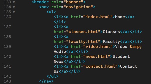
In the <nav>, create an unordered list of Home, Classes, Faculty, Video & Audio (remember to use &), Student News, and Contact Us.
Add <a> links to each, linking to index.html, classes.html, faculty.html, video.html, news.html, and contact.html.
Copy that unordered list and paste in the <nav> in the footer as well.
Then for the last <li> in the footer, add:
<li><a href="http://www.facebook.com"><img src="../images/facebook.png" width="16" alt="Facebook link"/></a>
Wrapping the <img> element in an <a> tag turns the entire image into a button for that link.
Links
Go to the <article> "Support Classes" and, in the last line, create an <a> link around "classes page" and link it to "classes.html."
Go to the <article> "Competition Winners" and, in the last line, create an <a> link around "student news page" and link it to "news.html."
Styling the links
Under the /* TYPOGRAPHY */ section in our css, create a section called /* LINKS */.
Look at our InDesign document. Here the links are black and italic, with an underline. Go to the /* LINKS */ css and add:
a:link {color:black; style:italic; transition:all 2s;}
Notice that all our links, even the ones in the header and footer, become black and italic.
Notice that a:link is very similar to the pseudo-classes we looked at earlier; a:link is also pseudo-classes.
Now, honestly, I don't think this creates enough contrast between our text and the links. So let's take the color from our <h3> headlines — color: rgb(113,72,67) — and add that to the links, and see if that helps.
I tried that, and it still doesn't seem to help much. So, instead, let's try font-weight:bold, font-style:normal, text-decoration:none;. That seems to provide enough contrast. (Normally we would ask the art director if that's okay, but I'm the art director, and it's okay with me.)
We now need to indicate when someone rolls over the link so they get feedback. We'll add back the underline as the indicator:
a:hover {text-decoration:underline;}
Header and footer nav
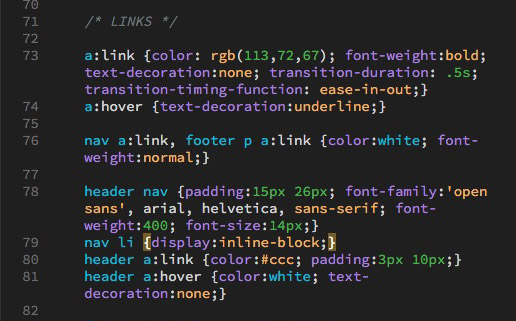
Then, the <header> and the <footer> both need to display inline instead of in a list. If we just specify an <li>, it could affect any <li> on the page. But both of the navs are in a <nav>, we could use those to be more specific. So next add to the css:
nav li {display:inline-block}
This displays the links in both the <header> and the <footer> in a line instead of in a list. We could have just used display:inline, but display:inline-block allows us to have padding and margin on the top and bottom of the <li> elements if we want them.
Next, we want the links in both to be white and not be bold, so:
nav a:link {color:white, font-weight:normal}
But wait! The link to the phone number in the text in the footer is the same as the link color in the body copy, but here it's too dark. We want it to be white, like the other links on this page. So let's specify that link in this css. Change it to:
nav a:link, footer p a:link {color:white, font-weight:normal}
Now we want to change the font in the header nav to Open Sans, and align it with the header text on the left. So in the /* LINKS */ add:
header nav {background-color:#000; padding:0 26px; font-family:'open sans', arial, helvetica, sans-serif; font-weight:400; font-size:14px;}
I've decided in this case that I want to change the link color to a light gray to match the rule, and add some padding to space the links out more:
header a:link {color:#ccc; padding:10px 10px 10px 6px;}
display:inline-block
The reason we didn't have the padding the same on all four sides of the attributes for header a:link is because of a peculiarity in display:inline-block. If there are a number of elements in a row (as there are with our links), and there is a space between the items, display:inline-block creates about a 4px space on the right side between the items. Not so bad if you have a sting of color blocks serving as buttons, but not so good here, as they would make our links seem off-center.
We have two choices for how to handle this:
- Remove all space between the <li> elements in our code (have them run together), or
- compensate by having the left side have
margin:-4pxor less padding on the left, as we've done here.
Centering display:inline-block
One advantage of display:inline-block is that you can tell the parent elements to text-align:center the child text; in this case, if you add header nav {text-align:center} your navigation will be centered.
Next, to have the links be white on rollover, and remove the underline:
header a:hover, header a:focus {color:white; text-decoration:none;}
And to return it to gray after it's been visited;
header a:visited {color:#ccc;}
Finally, notice that the <nav> in the <header> is waaay up at the top. First, let's add padding-top:15px to the header nav. Now that looks fine, but if we close the browser window down, when the links become two lines deep, they extend out of the <header>. The best way to solve this is to remove the height from the header nav. But then the header is shorter, right up against the bottom of the links. so we also add padding-bottom:15px to the header nav and everything works.
Cleaned up, the complete coding for the links looks like:
Footer nav
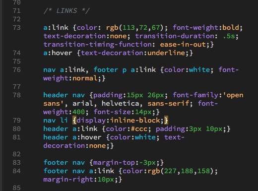
Finally we style the footer nav. Change the color a little to differentiate the links from the text, and add margin on the right to space them out:
footer nav a:link {color:rgb(227,188,158); margin-right:10px;}
Finally, the baseline of the links seems a little off from the baseline of the text so I can adjust the baseline of the links by adding negative margin to the top of the footer nav (or positive margin to the text):
footer nav {margin-top:-3px;}
Completed it looks like this:
Responsive top navigation
This section is based on W3C How To — Responsive Top Navigation. (But it's not exact because they chose to not wrap the nav links in an unordered list.)
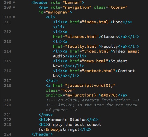
Add class="topnav" id="myTopnav" to the <nav> in the <header> element.
Add this link after the closing </ul> element:
<a href="javascript:void(0);"
class="icon"
onclick="myFunction()">☰</a>
<!-- on click, execute "myFunction" -->
<!-- ☰ is the 'hamburger' icon -->It looks like this:
In the css, at the end of the /* LINKS */ We add:
/* We tell .topnav a.icon to hide. */
	.topnav a.icon {display:none;}
Next, at the end of the /* MEDIA QUERIES */ We add:
/* When the screen is less than 768 pixels wide, hide all links, except for the first one ("Home"). Show the link that opens and closes the topnav (.icon) */
@media screen and (max-width: 768px) {
	.topnav li:not(:first-child) {display: none;} /* everything except first-child hidden */
	.topnav a.icon { /* icon displays */
	display: block;
	}
}

/* The "responsive" class is added to the topnav with JavaScript when the user clicks on the icon. This class makes the topnav look good on small screens (display the links vertically instead of horizontally) */

@media screen and (max-width: 768px) {
	a.icon { /* positions the "hamburger" icon */
		position: absolute;
		right: 26px;
		top: 15px;
	}

	.topnavresponsive li { /* tells links to display and stack */
		float: none;
		display: block;
		text-align: left;
		line-height:1.6;
	}
}
Finally, at the bottom of our page, just before the closing body tag, we add:
<script>
/* Toggle between adding and removing the "responsive" class
to topnav when the user clicks on the icon */
function myFunction() {
	 var x = document.getElementById("myTopnav");
	/* if class name is topnav, change to responsive; if it isn't, change it to topnav */
	 if (x.className === "topnav") {
		  x.className += "responsive";
	 } else {
		  x.className = "topnav";
	 }
}
</script>
Mobile navigation summary
How this works:
- We add a ☰ button (sometimes known as a "hamburger" button) to the right of the menu. We use
position:absoluteso the hamburger button doesn't interfere with the menu. (Like floating an element, making it position:absolute removes it from the normal flow of the document.) - We hide that button when the browser is over 768px.
- When the screen is reduced to 768px the button appears. All the list elements other than the first one are changed from inline-block to block, so they stack. The list elements are then hidden using
display:noneso they don't take up any space. - When you click on the button, the javascript changes the list items' class names; the new class uses
display:blockinstead ofdisplay:none, which un-hides them. - When you click on the button again, the class name is changed back and they are hidden again.
Some other options for mobile navigation
Some other options for mobile navigation can be seen at: 10+ Responsive Menus and Navigation Solutions
(Note: Author James notes in his research at the bottom that he is seeing a decline in mobile users clicking on hidden menus; so his recommendation for a "priority menu" might be a better solution than the one I've outlined above, while what I've outlined above is a more common industry solution.)
If you need drop-down menus at the desktop stage, try Slicknav.
Final Validation
If you are using Dreamweaver, look through the code for line numbers that are in red, indicating there is a problem. Click the red numbers and they should give you an idea what the problem is.
If Dreamweaver that you have unclosed elements and aren't sure what they are, you can insert your cursor before the </body> element at the bottom of your page, type </ and hit return, and it will auto complete whatever hasn't been closed. Look for those unclosed elements, close them, and try again until you get </body> right before </body>, and then you'll know all the unclosed elements. (Working on these instructions I had as many as six unclosed <p> elements I had to go back and find.)
Once you've fixed all the line number errors, go to File>Validate>Current Document (W3C) and your document will be validated.
W3C HTML Validator
If you don't have Dreamweaver, copy the code from your page, go to the HTML Validator at https://validator.w3.org/, paste your code in, and it will tell you on which lines your html has errors. Fix the code and repeat the process until you don't have any errors.
If you are having problems with your css, they also have a CSS Validator at https://jigsaw.w3.org/css-validator/.