Deane Nettles | Advertising & Graphic Design
STUDENT DESIGN/ILLUSTRATION PORTFOLIOS
- Overall standards
- Portfolio examples
- Design portfolios
- Design portfolio tips
- Illustration portfolios
There are two approaches to presenting a portfolio to a potential employer:
- Presenting your portfolio to the employer, explaining what you wanted to do, apologizing for why your pieces didn't turn out that way, then explaining what you are really good at and apologizing for why there are no examples of that in your portfolio either, and asking them to hire you anyway.
- Presenting a competent portfolio to the employer with work that you are happy with and impresses them enough to want to hire you.
Which approach is easiest? Most effective? Which do you want to use?
Standards
What a professional designer looks for in a portfolio, in the order they see it:
- Excellence of design.
- Does it look good?
- Is it interesting? Does it grab my eye? Make me curious?
- Is the concept appropriate to the client? Does it explain what is being explained? (There are any number of ads out there that are eye-catching, but have no clear connection to do with what they are trying to promote.)
- Is it legible? Can the people it's aimed at understand it?
- Is all the information there? (What the piece is about, product info, addresses, phone and web address, etc.)
- Is it organized so it's easy to understand? (Headline, subhead, body copy, footnotes — hierarchy)
- Are design elements consistent? (Or consistently inconsistent and ideosyncratic?)
- Excellence of craft. NO misspellings or poor grammar, widows, orphans, bad line breaks or improperly-used dashes! Elements line up, elements not left out (envelopes have return address on them in the proper place, direct mail pieces have the correct indicia, pieces are folded, glued or stapled correctly — in other words, technical details correct). Is it neat and clean? Does it look "professional"?
- Excellence and originality of overall ideas. Cleverness counts. (Get "A Smile of the Mind" for an excellent discussion and examples of this, and look at the Red Oxx campaign below.)(Not expected so much in beginning portfolios, but if it's there, it's another reason to hire you.)
Portfolio Examples
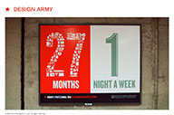
Go to Design Army
Design Army is a local design firm that grew out of Supon Design Group. They are the most exciting design studio in Washington, and do work for clients including the Washington Ballet, Signature Theater, and design organizations both local and national.
Go to Louise Fili
Louise is a logo and package designer of international reputation. Much of her work is based on modern renditions of historical styles, particulrly Victorian-era and early American vernacular design. This is a very clear, clean portfolio.
Go to Pentagram
Pentagram is the largest strictly-design firm in the world, and cover every aspect of design and architecture. They are a design partnership; the designers own the company. Their work is as far-reaching and eclectic as their owners.
Go to: Nicholas Cryder
This is a personal advertising portfolio, so it includes television advertisements and transit campaigns and doesn't include logos and letterhead. It is a portfolio based on a simple, good-looking template. Specifically look at the overall print campaign for First Ascent and the initial print campaign for Red Oxx:- the First Ascent campaign for the sheer beauty of his collages and his subtle use of their logo in his design, his use of danger red and sky blue (and notice that, apart from the logo and some font and color choices, the ads in the series are all VERY different);
- the initial campaign for Red Oxx for it's play off the tagline "killer bags"; the twist is in taking a term usually applied to expensive fashionista bags and (1) applying it to an ugly bag and (2) taking it literally.
In looking at professional portfolios, It is important to realize in ALL of these cases that the sum-total of their work was not done by them alone with their Mac, CS5 and stock.com; they have other art directors and designers working for them, and hire the best writers, photographers, illustrators, musicians, and programmers when they need them. With few exceptions, creating the very best design involves working with others.
Now, lets talk about the pieces in your portfolio.
Design Portfolio
You want a healthy variety of pieces; what they are can vary depending on your skills and preferences, but could include one each of:
- Logo, letterhead, envelope and business card package Logo should be simple and strong, conveying well in both black and white and a solid color. (The simpler the logo, the more versatile it is.) Though the world is changing, a letterhead that can be printed in one color+black will always be cheaper to print and better for the environment than a logo that can only print in 4+ colors. This demonstrates both your image-making abilities and your ability to create a uniform style in different formats.
- Brochure Could be a folder (single page that folds into several panels) or a brochure (several separate pages saddle-stitched together). This demonstrates your ability to convey a large amount of information sequentially over several pages; folders add the ability to deal with a non-linear arrangement of pages and the mechanics of folding.
- 3 ads in a series A series of ads for a single client shows several ideas in a similar form, or or the same idea in slightly different forms. Ads should be strong, either in concept (see Red Oxx) or execution (see First Ascent), so that they stand out from the clutter of poorer ads around them. (Advertising/design competition winners have both — see Communication Arts Advertising Annual for more examples.) Ad series demonstrate both your ability to concept and to marry strong headlines with strong images.
- Schedule or program listing Go to most any museum, look at their program listings and create one of your own. This demonstrates your ability to handle large amounts of type in a small space, and make it consistent and understandable.
- Cover and several inside pages of a magazine and/or annual report Similar to brochure. Magazine design shows ability to design around an article; an annual report shows ability to design to a brand.
- Poster Demonstrates the ability to work in a large format and to work simply and boldly.
- Package design Package design gives you the challenge of working three-dimensionally, with lots of scores and folds or in unusual materials, while including all the information required, such as bar codes and contents listings. Demonstrates the ability to work in 3D
- Web design Generally a home page and an inside page. Demonstrating your ability to both design for the web, design navigation, and to design a cover and inside that are designed consistently.
The ideal portfolio will have a strong logo design and letterhead package and have two other pieces that also use that logo, with a design style consistent with the letterhead package (such as a brochure and a website that look like they are part of the same family) to demonstrate your ability to create a style and use it consistently in several media.
Design Portfolio Example
Go to www.gridlondon.com
A good portfolio, still with student work in it. Note the cleanliness of the design and the high quality of the typography and photography. The poster, in particular, is smart, because it appeals to designers, and he can both use it as a calling card and sell it. (This portfolio has improved greatly since I first added it in 2010.)
For more examples of both student and professional portfolios, see creativehotlist.com.
Design Portfolio Tips
To have a really outstanding portfolio:
- Only include your very best work, never the work you think you could have done better. (If it's not good enough, make it better.) Keep it to 8-12 pieces.
- Be able to explain the choices you made in designing it. What's my concept? How does my design fit my concept? How did I make it interesting? Legible? Why did I think this part was the most important and how did I convey that?
- Don't just use the fonts you have; use the fonts that are best.
- If you are going to use stock art, pick the best stock art you can find. If you can't find what you want, find a photographer to help you; don't let the lack of an image stop you.
- Consider teaming up with photo and illustration students who are better than you to produce original art for your designs, both to create variety and to demonstrate your ability to work with others.
- Review your portfolio every six months, and improve or replace pieces as you get better.
- Start a portfolio of pieces that you wish you had done, as a yardstick to measure your own portfolio by.
Illustration Portfolio
6–10 of your best illustration examples, preferably in a consistent style. Some categories:
- Editorial A clever visual representation of an idea
- Pictorial Illustrating something and someone
- Instructive Charts, instructional diagrams and maps
- Logos and symbols Simple, graphic representations of ideas
- Stories Multiple illustrations that tell a story; comic strips, comic books, graphic novels.
Ideally, these pieces should be shown in use, in a magazine spread, in a brochure, in a completed package design. You may want to team with a design student or offer your services to a design firm in return for finished-looking samples.
How varied your categories are will depend on the area you prefer to work in and how versatile/appropriate your style is.


