Detailed Projects
Return to top

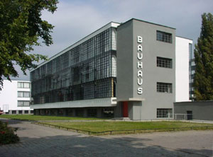
Bauhaus
1925–26, Dessau, Germany, photo by Detlef Mewes
In his design, Walter Gropius refined architectonic ideas he first put into practice before WW I in the construction of the Fagus-Werke in Alfeld an der Leine. In Dessau as in Alfeld, the glass curtain wall suspended in front of the load-bearing framework defines the exterior of the workshop wing and openly shows the constructive elements. Gropius, rather than visually amplifying the corners of the cubic body of the building, allowed the glass surface to overlap the edges, thereby creating the impression of lightness.
Gropius consistently separated the parts of the Bauhaus building according to their functions and designed each differently. He thereby arranged the different wings asymmetrically – in relation to what is today the Bauhausstraße and the Gropiusallee respectively. In order to appreciate the overall design of the complex, the observer must therefore move around the whole building. There is no central viewpoint.
The glazed, three-story workshop wing, the block for the vocational school (also three storys high) with its unostentatious rows of windows, and the five-story studio building with its conspicuous, projecting balconies are the main elements of the complex. A two-story bridge which housed, e.g., the administration department and, until 1928, Gropius’s architectural practice, connects the workshop wing with the vocational school. A single-story building with a hall, stage and refectory, the so-called Festive Area, connects the workshop wing to the studio building. The latter originally featured 28 studio flats for students and junior masters, each measuring 20 m². The ingenious design of the portals between the foyer and the hall and a folding partition between the stage and the refectory, along with the ceiling design and color design, impart a grandiose spatial coalescence to the sequence of foyer-hall-stage-refectory, shaping the so-called Festive Area. The façade of the students’ dormitory is distinguished in the east by individual balconies and in the south by long balconies that continue around the corner of the building.
The entire complex is rendered and painted mainly in light tones, creating an attractive contrast to the window frames, which are dark. For the interior, the junior master of the mural workshop, Hinnerk Scheper, designed a detailed color plan that, by differentiating between supporting and masking elements through the use of color, aimed to accentuate the construction of the building.
(http://www.bauhaus-dessau.de/the-bauhaus-building-by-walter-gropius.html, 2/1/2016)

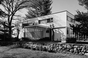
Walter Gropius House
1938, 68 Baker Bridge Road, Lincoln, Middlesex County, MA. Photo by Jack E. Boucher - Library of Congress, Prints and Photograph Division, Historic American Buildings Survey: HABS MASS,9-LIN,16-20 alter Gropius photo
Working with local Concord, Massachusetts, builder Casper J. Jenney and approximately $20,000, the Gropius’s wanted their home to reflect its surroundings and traveled around New England studying vernacular architecture. In designing the house, Gropius combined traditional elements of New England architecture such as clapboard, brick, and fieldstone, with new, innovative materials, some of them industrial, such as glass block, acoustical plaster, and chromed banisters, along with the latest technology in fixtures. The design of the Gropius House is consistent with Bauhaus philosophies of simplicity, functionality, economy, geometry, and aesthetic beauty determined by materials rather than applied ornamentation.
Gropius used traditional New England building materials and architectural elements in intriguing ways, like the vertical clapboard walls of the front hall which are not only functional but beautiful. Gropius used their vertical orientation to create the illusion of height as well as a practical surface for hanging an ever-changing collection of artwork; wood is an easy surface to nail, patch, and paint. The entrance is an example of how Gropius interpreted a center entrance Colonial with a Bauhaus twist. This portico is on a diagonal that leads the visitor to the front door according to the natural approach. A glass block wall protects from wind and rain, yet allows light to permeate the entry passage as well as the interior hall. Mrs. Gropius noted that repairs were “kept to a minimum because the house was remarkably well built.” After weathering criticism and bewilderment about the house’s unusual design and materials from fellows in the local lumber yard, builder Casper Jenney of Concord was vindicated in the eyes of his colleagues after the house survived the devastating hurricane of 1938 with minimal damage.
Many of the fixtures in the Gropius House were sourced from non-traditional commercial catalogs. For example, the hall sconces were ordered from hotel catalogs. On each side of the bathroom mirrors, half-chrome light bulbs redirect light to the sides and reflect light back to the mirrors. This creates flattering light, while simultaneously eliminating the need for any additional lighting shade or cover. The towel rack was installed on the hot water radiator to warm the towels, which in 1938 was an idea ahead of its time. The Gropius House has four bathrooms, two on the first floor and two on the second floor; they are all plumbed on one main stack for efficiency and economy. All four bathrooms were located in the less prominent northwest corner of the house, where solar gain and views were not important.
Above the Marcel Breuer-designed white Formica dining room table is a ceiling light fixture that was a type used by museums to highlight a piece of artwork. It has a particular adjustable aperture so that it illuminates only to the perimeter of the table. This dramatic lighting effect was used by the Gropiuses as part of their entertaining repertoire of sparkling dishes, floral arrangements, cast shadows, and flattering light.
Gropius experimented with non-traditional materials such as the California acoustic plaster found throughout the living and dining room walls and ceilings as well as elsewhere in the house. A very porous substance that unfortunately has “greyed” over time from its original white color, it was applied with a spray gun over the lath. Its sound-absorbing characteristics still function effectively.
(http://www.historicnewengland.org/historic-properties/homes/Gropius%20House/gropius-house-history, 2/1/2016)
“As to my practice, when I built my first house in the U.S.A. — which was my own — I made it a point to absorb into my own conception those features of the New England architectural tradition that I found still alive and adequate. This fusion of the regional spirit with a contemporary approach to design produced a house that I would never have built in Europe with its entirely different climatic, technical and psychological background.” —Walter Gropius, Scope of Total Architecture, 1956

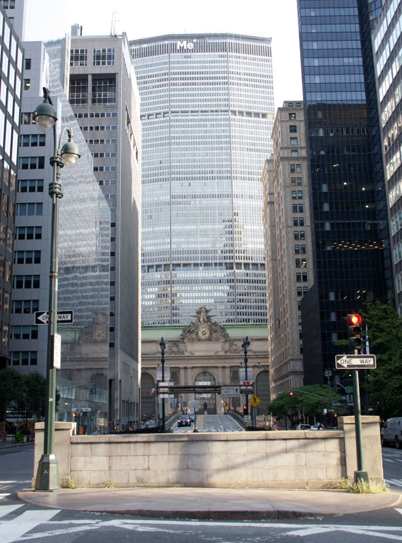
MetLife Building
1960-63, New York, NY. Photo by Deane Nettles
The MetLife Building is a 59-story skyscraper at 200 Park Avenue at East 45th Street above Grand Central Terminal in Midtown Manhattan, New York City. Built in 1960–63 as the Pan Am Building, the then-headquarters of Pan American World Airways, it was designed by Emery Roth & Sons, Pietro Belluschi and Walter Gropius in the International style. The world's largest commercial office space by square footage at its opening, it remains one of the hundred tallest buildings in the United States.
When it opened on March 7, 1963, the Pan Am Building was an unpopular sight due to its lack of proportion — its huge scale dwarfed both the New York Central Building to the north and Grand Central Terminal to the south. The building was surpassed in size by the World Trade Center in 1970–71 as well as 55 Water Street in 1972. (https://en.wikipedia.org/wiki/MetLife_Building, 2/1/2016)
