My Portfolio Site Background and Goals
I. Overall information
Patricia Elia
Woodbine, MD
pelia1@students.towson.edu
(443)-360-7464
Find me on Social Media!
_
Describe yourself in 150 words.
_
Accepting, Adventurous, Agnostic, Animal Lover, Animated, Ambitious, American, Amicable, Ambivert, Approachable, Arabic, Artistic, Beginning, Brave, Brunette, Compassionate, Considerate, Cooperative, Capricious, Careful, Caring, Cautious, Cheerful, Connecting, Communicative, Competitive, Constructive, Curious, Daring, Dedicated, Determined, Diligent, Driven, Eager, Educated, Engaging, Enterprising, Emotionally Intelligent, Empathetic, Enduring, Enthusiastic, Environmentalist, Erudite, Experienced, Explorer, Expressive, Fair, Flexible, Freckled, Friendly, Female, Gamer, Generous, Grateful, Gregarious, Growing, Helpful, Honest, Hopeful, Humanist, Humorous, Inclusive, Independent, Individualistic, INFP, Inquisitive, Imaginative, Irish, Italian, Jovial, Keen, Leaderlike, Little, Lively, Loving, Loyal, Marylander, Mature, Meticulous, Motivated, Nerdy, Nice, Nurturing, Observant, Open-minded, Optimistic, Organized, Outgoing, Pale, Passionate, Patient, Perfectionist, Persevering, Persistent, Personable, Petite, Playful, Pleasant, Positive, Powerful, Preservationist, Progressing, Progressive, Purposeful, Quick-witted, Quippy, Rebellious, Resolute, Respectful, Restorative, Resourceful, Sangfroid, Sanguine, Searching, Sensitive, Short, Silly, Social, Spirited, Stalwart, Steadfast, Stoic, Strong-willed, Striving, Supportive, Talkative, Tenacious, Team Oriented, Thankful, Thoughtful, Tolerant, Understanding, Unwavering, Upbeat, Uplifting, Unrelenting, Vegetarian, Vigilant, Virile, Wanderer, Welcoming, Well-meaning, Willing, Witty, Wondering, Woodbiner, Young
What design/photo/illustration skills are you good at? What are your strengths? Are they the same as what you want to do?
_
Design: Coding, Grid Design, Color Schemes
Logo Design, Typeface Design,
Reportage
Pen and ink, Sharpie, Chalk Pastels, Oil Pastels, Colored Pencil
Digital Collage, Image Trace Design
Physically Drawn Images with Digital Editing and Coloring
These skills align with my current ambitions and I plan to cultivate these skills until my dreams come to fruition. I would like to be a graphic designer and a comic book artist.
Do you have any work experience doing any of that?
_
I do not have any work experience...yet!
I do have 3 and a half years of class experience.
What type of design/illustration/photography/other do you want to be known for?
_
Graphic Novels, Website Design, Identity Creation
What are the basic goals of this site? (e.g., branding/identity reinforcement, improved access to information, direct sales, corporate communication, etc. — these would affect how you design the site.)
_
Branding, Identity Reinforcement, Improved Access to Information and Portfolio, Direct Sales, Creating a Webcomic
II. Overall Site
When does this new website have to be done by?
_
December 18th, 2018
Is there a size that this site has to be?
_
5+ pages, 12+ samples of artwork with descriptions
What design/photography/illustration that you have created do you want to highlight?
_
Kit of Parts, Jewelry, Sculpture, Watercolor and Pencil Portrait of Caera, Zine, Typeface, Typography
What work that has been done already toward designing/redesigning this web site? (Writing text, collecting images, etc.)
_
Collecting Images
What work remains to be done?
_
Design, Coding, Text, Completed Image Search
Design Issues
Do you have a logo/website/other already done that you'll want this new site to use?
_
I will have made an identity kit in my typography class by the time this project is done, so I can definitely incorporate the logos/type/other components from that. I also have a special signature that I am working on and once I flesh that out I can incorporate that as well.
Do you need to redesign your logo?
_
Yes, it feels unresolved.
Do you like light colors? Bright colors? Dark colors?
_
I appreciate all colors, but a color scheme of mostly light with a few dark colors will work best to create a smooth, erudite-looking website. The background of my site will be white or an off-white variation of a color. Text will be a darker color as well as parts of my site that I want to highlight.
Do you like designs that are simple or complex? If you've had art history, do you prefer classic (simple, uncomplicated) or baroque design?
_
I prefer site designs that are simpler. Complex can also work but I get overwhelmed easily so it has to be organized and straightforward.
Conversly, in Art History I prefered complex works from the baroque, rococo, and renaissance period. I find the richness of these works very captivating.
_
It might seem counterintuitive for me to prefer simplicity for websites but complexity in artwork, but I feel that because websites are mostly for extracting information and there is no such expectation for interacting with art, simplicity and complexity make sense for both these interests respectively.
Promotion
What will you have to do to promote your site?
_
I will promote mostly on my social media and buisiness cards. I will include a hyperlink to my site in my bio for facebook, instagram, and Etsy. I will also post to facebook, instagram, and snapchat when I upload something new to my site or when I'm having some sort of promotion.
What is your long-term plan for the site? (The next 1-3 years?)
_
I would like to post my entire portfolio to my website, run a successful store, and house a periodical webcomic or two. The periodical webcomic will encourage consistent traffic to my site and hopefully attract potential customers, clients, and employers to my portfolio and store.
What can you create that will have people coming back to look at your site?
_
I will create a store and a serial webcomic to encourage people to return to my site.
How often will you update the site?
_
I will update my site biweekly, hopefully weekly once I nail down a process for my webcomic. I will also update my site when I have new pieces for my portfolio or Etsy store. Whenever I update my website, I will promote it on my social media to attract new and returning patrons.
Google "web hosting" to find out how much it would cost to host a site for a year. How much would it be?
_
For my purposes, the prices range from $1.99-$75 per year depending on the provider. I will also have to take into account the expenses for listing items on my etsy site.
III. Your Website Audience
What types of visitors do you want to attract? (Friends, family, faculty determining if you get into your program, potential clients, potential employers, other?)
_
I hope to attract clients interested in hiring me to design an identity, website, broadside, or like media. I hope to attract employers interested in highering me to create concept art, design identity media, and similar jobs. I also hope to attract potential customers who will enjoy my stories and merchandise.
What are your goals for each type of visitor? (such as "they'll like my work and call me to hire me")
_
- Clients: That my portfolio will inspire them to envision what I can create for them.
- Professors: That the professor who assigned this will appreciate my webdesign, portfolio, and overall composition enough to award me a decent grade.
_
That other professors will learn about my capabilities and interests through this website enough to help me network and provide feedback on how I can improve on my creative process. - Employers: That what I present of myself in my portfolio and site design will help them accurately assess whether I would be a good fit for their team.
- Customers: That my webcomic will entertain and inform them, hopefuly enough to entise them to make a purchase or two from my Etsy.
- Aspiring Artists and Creators: That my work will inspire them and that they will consider collaborating or networking with me.
- Casual Comic Coneseurs: That my webcomic will entertain and inspire them to keep reading.
- Hard Core Comic Coneseurs: That they won't think my comic sucks.
_
_
_
_
_
_
If it’s for potential clients, what three products/services will you provide to them?
_
- Service 1: Web Design
- Service 2: Identity Kit Design
- Service 3: Broadside/Print Design
What are your goals for this site? To earn income? Get attention/create word-of-mouth? Other?
_
Research
IV. Your Website Competition
Who are three (3) of your design competitors? (Google other designers/illustrators/photographers, with similar interests and in the area where you are living, and pick sites that inspire you.)
Three of my competitors whose sites I like are:
Competitor 1
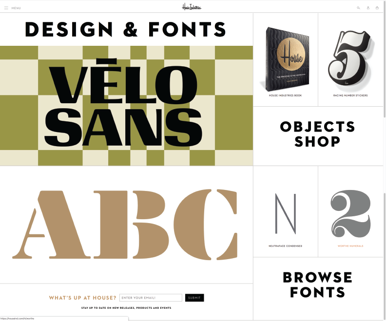
Name: House Industries
What is their website address?
What do they do?
_
House Industries creates typefaces and merchandise using traditional methods. They also work extensively on comission and through collaboration with other corporations such as Jimmey Kimmel Live, the New Yorker, Target, the Cher Show, and Shake Shack.
What are some good points and some bad points of how their website looks (color, fonts, layout, etc.)?
Good: Very clean and crisp. Orange, white, and black makes for a very warm color scheme. Animations are quick and seamless but not dizzyingly fast. They use good Sans Serif Fonts, attention grabbing and words are minimal so it is not necessary to use a Serif font.
Bad: I cannot bring myself to critique anything about their website's appearance.
What are some good points and some bad points of how their website works?
Good: The hamburger list is hidden until you need it, all of the images grey when you hover over them to show that they contain hyperlinks, and everything is organized and easy to find.
Bad: The icons in the top right corner don't work on all pages of the website, plus their symbolism is not as clear as it could be. It is also not immedietly clear what the images on the homepage stand for.
How well is the site written? (If it’s written at all. Might just be images.)
_
The site is written in a high enough register to sound intelligent and creative but not so high that it's innaccessable to a lay person.
Is it easy to find their contact information?
_
Their contact information is listed as an option under their hamburger icon. It is not on primary display, but it does not take much digging to locate and is intuitive for a regular internet user.
What method do they use for navigating their portfolio?
They hyperlink different sections of their portfolio on their front page. The sections of their portfolio are the easiest things to find on their website.
Is it easy to navigate their portfolio?
It is fairly simple to navigate their portfolio -- just click on the image that represents a category of their work (Design and Fonts, Scripts, and Fonts). They also feature certain typefaces with larger typefamilies on the front page of their site.
How many portfolio pieces seem to be on this site? Is that too much or too little?
They have a very comprehensive portfolio. It is plenty.
Once you've found an image on their site, can you find it again?
_
Yes
What would you do differently/better?
I would change the color scheme for my personal website. Their color scheme works well for them but it does not fit with my personal artistic identity. The bottom left panel also seems a bit awkward to me since the majority of their website is image based while this one section is very text heavy.
Competitor 2
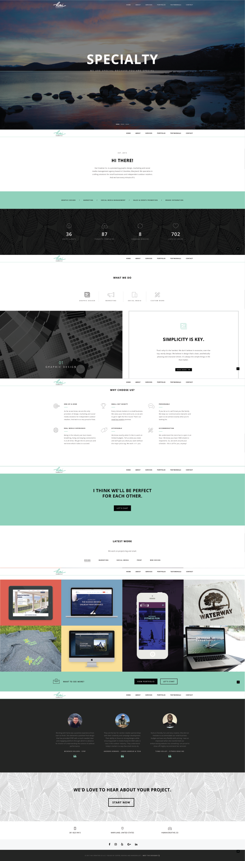
Name: Kai Creative
What is their website address?
What do they do?
According to their website, Kai Creative offers graphic design, marketing, and social media services and solutions to small businesses and independent outdoor retailers.
What are some good points and some bad points of how their website looks (color, fonts, layout, etc.)?
Good: Consistent color scheme, black, white, grey, green, and a splash of red orange. San serif fonts, image heavy but also lots of text. Text isn’t very long. Over all, a very clean layout.
Bad: Very long, there is a lot of scrolling. This is neither good nor bad objectively, it's mostly a design choice, but it is not one that really works for me. There is also a lot of unnecessary informaiton.
What are some good points and some bad points of how their website works?
Good: Everything on their website is on one page, so it is not difficult to navigate. The site is very long but their organization of information is very straightforward and makes up for its size.
Bad: I cannot find anything to criticize. Their site is very interactive and functional.
The site is written clearly and professionally.
Is it easy to find their contact information?
Very easy, there is a hyperlink at top.
What method do they use for navigating their portfolio?
Everything is on one page, but there are hyperlinks that jump you to different sections of the page so if you are looking for something specific you do not have to do any scrolling.
Is it easy to navigate their portfolio?
Yes
How many portfolio pieces seem to be on this site? Is that too much or too little?
Too little, but the pieces they have are strong and representative if their abilities.
Once you've found an image on their site, can you find it again?
Yes
What would you do differently/better?
My website wouldn’t be so outdoors based, so I would choose a different color scheme. Also, the site is a little too busy for my purposes. I prefer more concise sites.
Competitor 3
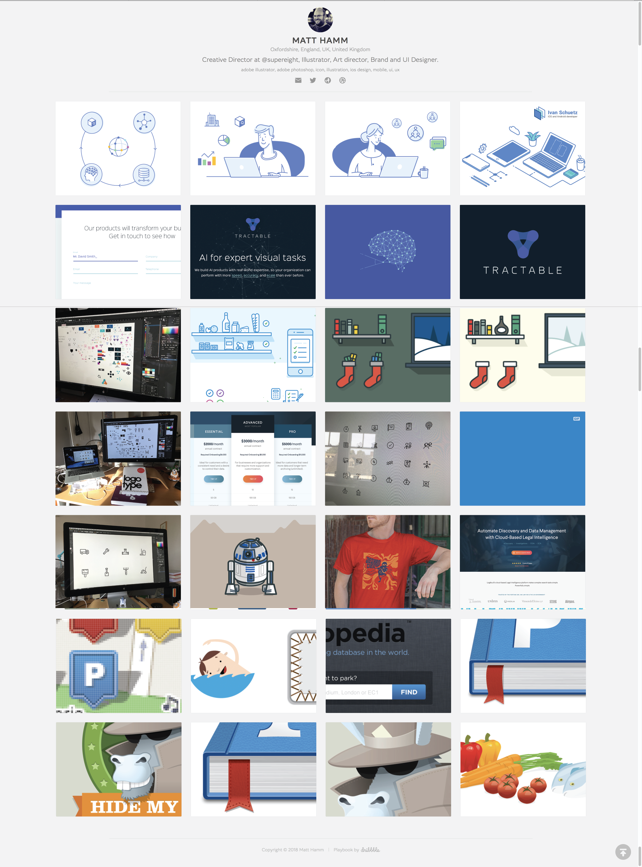
Name: Matt Hamm
What is their website address?
What do they do?
Creative Director at @supereight, Illustrator, Art director, Brand and UI Designer
What are some good points and some bad points of how their website looks (color, fonts, layout, etc.)?
Good: Not too busy, minimalistic, Hamm’s work is primary focus of website to attract new contractors/customers. Clicking on an image makes a temporary pop up where the image is bigger, details about its commission and process are included, and you can close it to go back to the main website. Has a back to the top button that follows you. Very clean layout. Long scrolling, but there’s no important information at the bottom so it doesn’t matter. Good hover animations. Sans serif fonts. Image heaviness keeps reader engaged.
Bad: The top is a little plain. Not very interesting.
What are some good points and some bad points of how their website works?
Good: Good hover animations. Good use of hyperlinks and pop-ups.
Bad: Website requires a lot of scrolling, loading makes scrolling lag.
How well is the site written? (If it’s written at all. Might just be images.)
Very simple, straight-forward. Site is image driven and words supplement images well.
Is it easy to find their contact information?
Yes. Everything is at the top of the page.
What method do they have you use for navigating their portfolio?
Scroll to view images of works, click on image for more information.
Was it easy to use that method?
Very straightforward, everything contained on one page. Couldn’t be easier.
How many portfolio pieces seem to be on this site? Is that too much or too little?
Very extensive portfolio, he has at least fifty.
Once you've found an image on their site, can you find it again?
Yes, but be prepared to scroll for a bit.
What would you do differently/better?
Simplicity is good for many purposes, but this might be a little too simple for my purposes. I might immitate him for my portfolio page, but if I were to use this as my main page, I'm not sure where I would put my webcomic. I also might add more to the header to make it more interesting.
V. Conclusion
What do you think is important to include in a site?
For my personal site, I feel as though it is important to include my identity (name, occupation, and the like), my skills (so potential employers get an easy sense of my abilities), an intriguing portfolio to keep people from clicking a way, a 'work in progress' and a shop to give yourself an easy way to promote your work and to give people reasons to return to your site periodically.
Is there a structure you saw (nav on the top, nav on the side, full background image, etc.) that you would like to use?
I appreciated the crisp and uniqueness of the House Industries website. I think that featuring a slideshow of their portfolio at the top of their page is an effective hook to visitors on the site. I like the modern font and the minimalism of the arrangement which keeps the site from feeling too overwhelming.
What color combinations did you prefer — Complex? Simple? Dark? Light? What colors did you like the best?
I think each site's color palette worked well for their intended purpose, however personally I am most partial to Kai Creative's palette. Their pastel colors and sparing use of darks made the page warm and inviting. I want visitors to my page to feel welcome and at home as well.
Did you see anything unusual or innovative you liked?
The layout of House Industry's page was very nontraditional and I appreciated their uniqueness. I will attempt to emulate this uniqueness in my own site. It was not centrally balanced like most website and was very asymmetrical. Their fonts were crisp and clean and their images were bright and attention-grabbing
Matt Hamm's site did an interesting thing with his portfolio. He forwent traditional site design and just made his entire site his portfolio with social media links. I appreciate the risk he took but I do not think that his design will work as well for my purposes.
Kai Creative also had an interesting matrix for their portfolio. They displayed their entire portfolio but also featured hyperlinks that would rearrange and exclude pieces based on categories. I think this was very interesting but it would have worked much better if they had included more pieces in their portfolio.
What did you see on other people's sites that you would like to include on yours?
I would like to emmulate House Industry's website structure the heaviest. I will take inspiration from Kai Creative's color scheme as well. For Matt Hamm I will most likely take some inspiration from his social media links but not much else.