Floats, clears and clearfixes
The default of elements
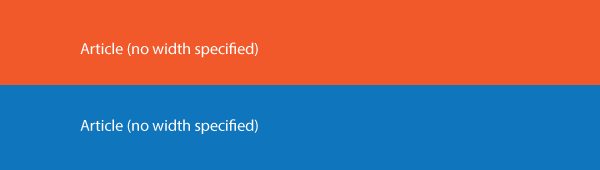
The default of standard elements in html/css is that they behave like they are 100% of the width of their container and that they float upward and to the left. Among the exceptions are the inline elements <strong>, <em>, <span>, and <a>.
Even if you set the width of an element to be narrow enough that several elements will fit on a line (above), the elements will continue to act like they are 100% of the width of the page, and will continue to stack.
1.Float
No Float

Lorem ipsum dolor sit amet, consectetur adipiscing elit. Nunc suscipit orci non eleifend suscipit. Etiam posuere commodo mauris ut lobortis. Nunc quis metus et dui feugiat ornare. Etiam at lobortis tortor, eget rhoncus lacus. Pellentesque aliquet, ligula quis luctus volutpat, purus ligula sollicitudin diam, id gravida velit enim ac augue. Vestibulum ante ipsum primis in faucibus orci luctus et ultrices posuere cubilia Curae; Vivamus velit sem, facilisis vel blandit ac, lobortis ut tortor. Proin accumsan dui vel nibh volutpat, sed bibendum dolor cursus. Donec eleifend urna blandit porttitor laoreet. Aenean blandit tincidunt risus sit amet elementum. Sed et eros ipsum. Curabitur in leo quis nibh rhoncus interdum.
Float Right
Lorem ipsum dolor sit amet, consectetur adipiscing elit. Nunc suscipit orci non eleifend suscipit. Etiam posuere commodo mauris ut lobortis. Nunc quis metus et dui feugiat ornare. Etiam at lobortis tortor, eget rhoncus lacus. Pellentesque aliquet, ligula quis luctus volutpat, purus ligula sollicitudin diam, id gravida velit enim ac augue. Vestibulum ante ipsum primis in faucibus orci luctus et ultrices posuere cubilia Curae; Vivamus velit sem, facilisis vel blandit ac, lobortis ut tortor. Proin accumsan dui vel nibh volutpat, sed bibendum dolor cursus. Donec eleifend urna blandit porttitor laoreet. Aenean blandit tincidunt risus sit amet elementum. Sed et eros ipsum. Curabitur in leo quis nibh rhoncus interdum.
<img src="image.jpg" style="float:right; margin:0 0 20px 20px;">
One way to have elements move up next to each other is to use the css attribute float.
Float was created as a method to wrap text around images (see above).
We can ONLY float elements left and right. There is no float center option. (It would've made no sense to have photos float in the middle of text.)
(In the above instance, I’ve added the css styling directly to the element. Don't do this; create a class like .fr_img {float:right; margin:0 0 20px 20px} and then add the class to each image you’ll use it on [<img src="..." class=“fr_img”>])
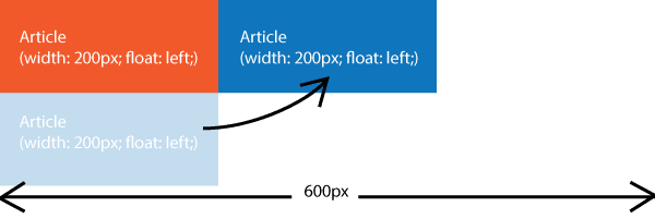
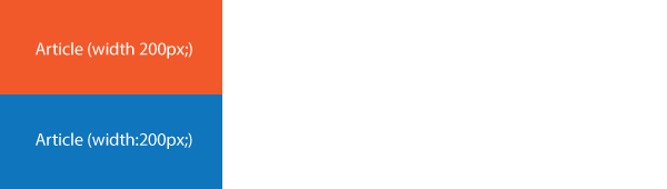
To float elements, you need to set their width narrow enough that more can fit on a line within their container, then float them left or right.
It often works best if you float ALL the items in a container; only floating some of the elements can produce unexpected results.
2.Clear
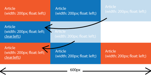
Once we start floating elements, sometimes we want them to stack again, even though they are floated. We do this by adding a “clear” to the item you want to stack. Clear can be clear:left (clears items floated left, clear:right [clears items floated right], and clear:both [clears items floated to the left or right]).
There is a flaw in the implimentation of float. When items are floated, they are taken out of the normal flow of the document. When they are taken out of the normal flow of the document, items that are not floated don't recognize them.
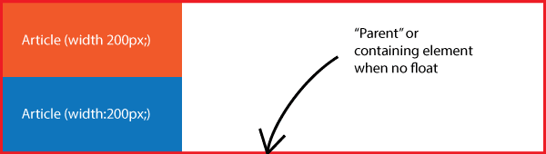
Here is a normal element stack (above).
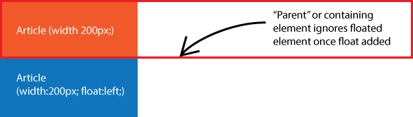
Here is the same stack with the bottom element floated. The result is that the parent or enclosing element doesn't recognize the floated element and collapses to only enclose the elements it does recognize.
![However, if we add another [third] element after the floated element, and tell the third element to 'clear', the parent element recognizes that last element and wraps around all three elements.](collapse3.gif)
Now we add an element to the stack and clear it. The parent element is no longer collapsed if the last containing element is cleared and entirely contains all its "children."
3.Clearfix Hack
This last cleared element is okay as long as there is a reason for that cleared element. If you are adding an element in at the end just for the sake of providing that last clear, that's poor coding. If there is no reason, the best solution is the "Clearfix Hack." There are several versions of the Clearfix Hack; I recommend: "A new micro clearfix hack."
Copy this code and place it in your css in the <style> element in your <head> (or in your style sheet):
/**
 * For modern browsers
 * 1. The space content is one way to avoid an Opera bug when the
 *    content editable attribute is included anywhere else in the document.
 *    Otherwise it causes space to appear at the top and bottom of elements
 *    that are clearfixed.
 * 2. The use of `table` rather than `block` is only necessary if using
 *    `:before` to contain the top-margins of child elements.
 */
.cf:before,
.cf:after {
    content: " "; /* 1 */
    display: table; /* 2 */
}

.cf:after {
    clear: both;
}

/**
 * For IE 6/7 only
 * Include this rule to trigger hasLayout and contain floats.
 */
.cf {
    *zoom: 1;
}
A class could be called anything; in this instance, if you look at the code, we're calling this class ".cf"
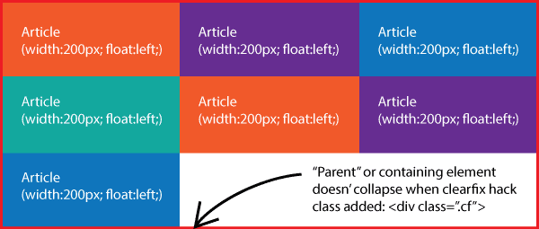
We attach the clearfix class to an element we want to contain floated elements without collapsing.
The floated <article> elements above are surrounded by a <div>.
To prevent it from collapsing we write the <div> as <div class="cf">.
4.Box Model
When you move items up next to each other, something to take into consideration is the width of the objects.
Now you would think that we would just declare a width for the item and that would be that, right?
It's a little more complicated than that, as you would find out if you just try it. It's useful to understand how it works so you have a place to start from when it doesn't work the way you THINK it will.
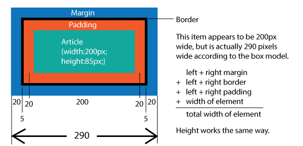
Elements are measured, not by their width, but by adding their width, their margin, their padding, and the width of any border added to them. So they are almost always going to be wider than you think they are going to be.
Ideally, to simplify the calculation, add:
	html {box-model:border-box;}
	*, *:before, *:after {box-model:inherit;}
to your CSS; then the width of your element is measured just by the width of the element plus the left + right margin.
5.Centering Floated Elements
The Box Model is important because floated elements can't be centered by themselves. They only float left or right.
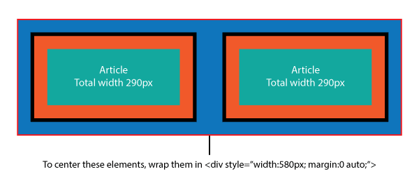
To center floated elements, they need to be placed in a container (like a <div>), which needs to match their width and then be set to {0 auto} to center. You can randomly change the width of that containing element until you get the container to fit the elements, but it's also possible to work out the measurements.
6.Using Percents for Mobile
Bye!
If we need elements that adjust to mobile devices, we either set break points where elements change size to fit the device, or we can use percentages for our measurements instead of fixed pixels.
For instance, the <article class="mobile"> elements above are set to .mobile article {float:left; margin:5%; padding:5%; width:30%; height:20vh; background-color:orange;}. So that's 5+5+30+5+5+5+5+30+5+5=100.
(Unfortunately you can't set the height to a simple percentage; scaling the height requires the vh (vertical height) measure; in this case, 20vh.)
7.Media Queries for Mobile
@media screen and (max-width:1300px) {
   div#wrapper {
   width:100%;
   max-width:800px;
   }
}
This css statement is a media query. In this case, it says that for devices with a screen (which includes mobile devices), any time the screen is less than or equal to 1300px, the <div id="wrapper"> will appear 100% of it's parent's width, up to 800px wide.
Media queries like this are really important for controlling how elements act at different screen sizes.
You can add as many css rules as you want within a media query; you could have your entire website change to a radically different style at a specific setpoint if you want.